

Honoring Home: How ‘Detroit 2’ Reframed a City Through Storytelling
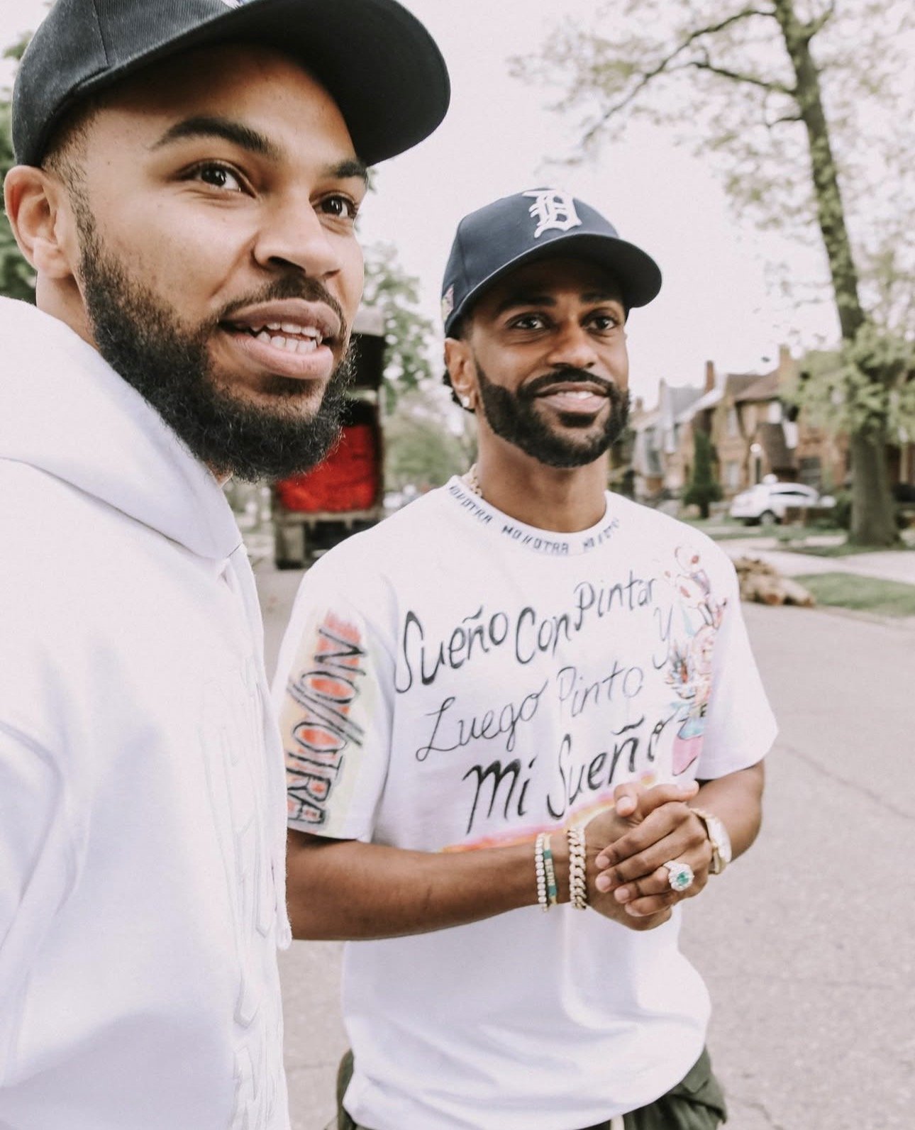
What does it look like to love your city out loud? When Detroit 2 was released, it wasn’t just an album; it was a visual experience. From the vinyl’s design to the music visuals and merch— each part of the project was chosen intentionally. Read on as we break down how a creative team built a visual language to honor Detroit.
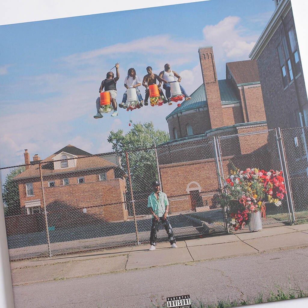
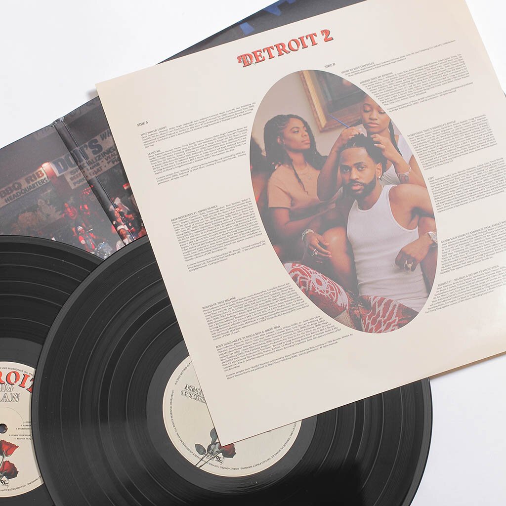
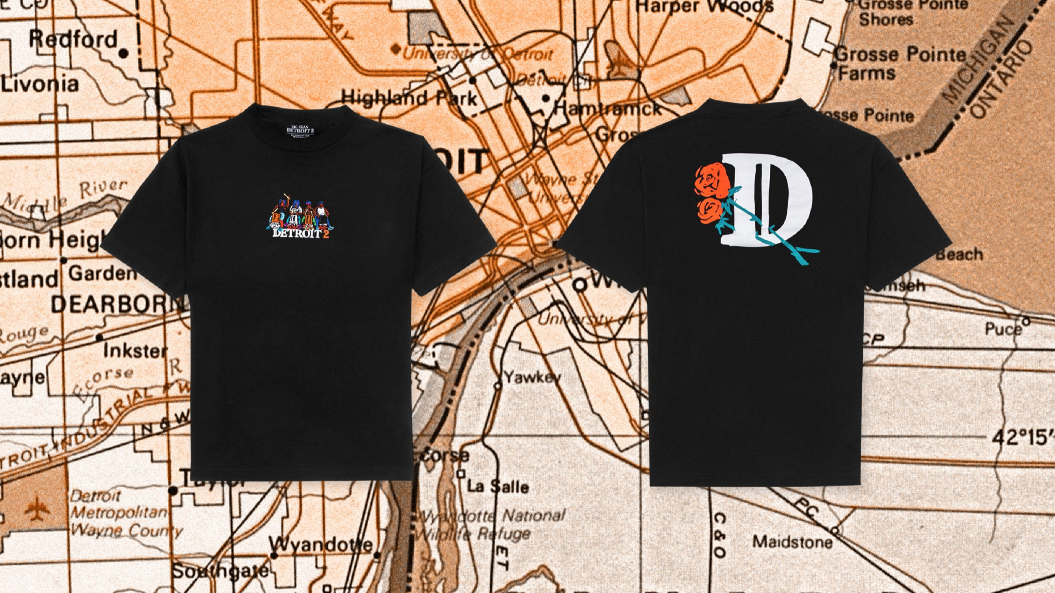
Detroit 2’s physical design is drenched in florals— a decision that felt intentional when the city is typically known for its toughness and grit. The choice to use florals has the consumer view Detroit in a softer and more vibrant light, which is the same lens through which Sean views his own city. Mike Carson, creative director and photographer, shared that the goal was simple: highlight Detroit’s beauty— its people and its culture. This wasn’t romance marketing, it was reclamation. Taking back the city’s name and broadcasting it the way it deserves to be seen. A team of designers, art directors, photographers, and creative leads built a consistent visual language— one that extended far beyond album work.

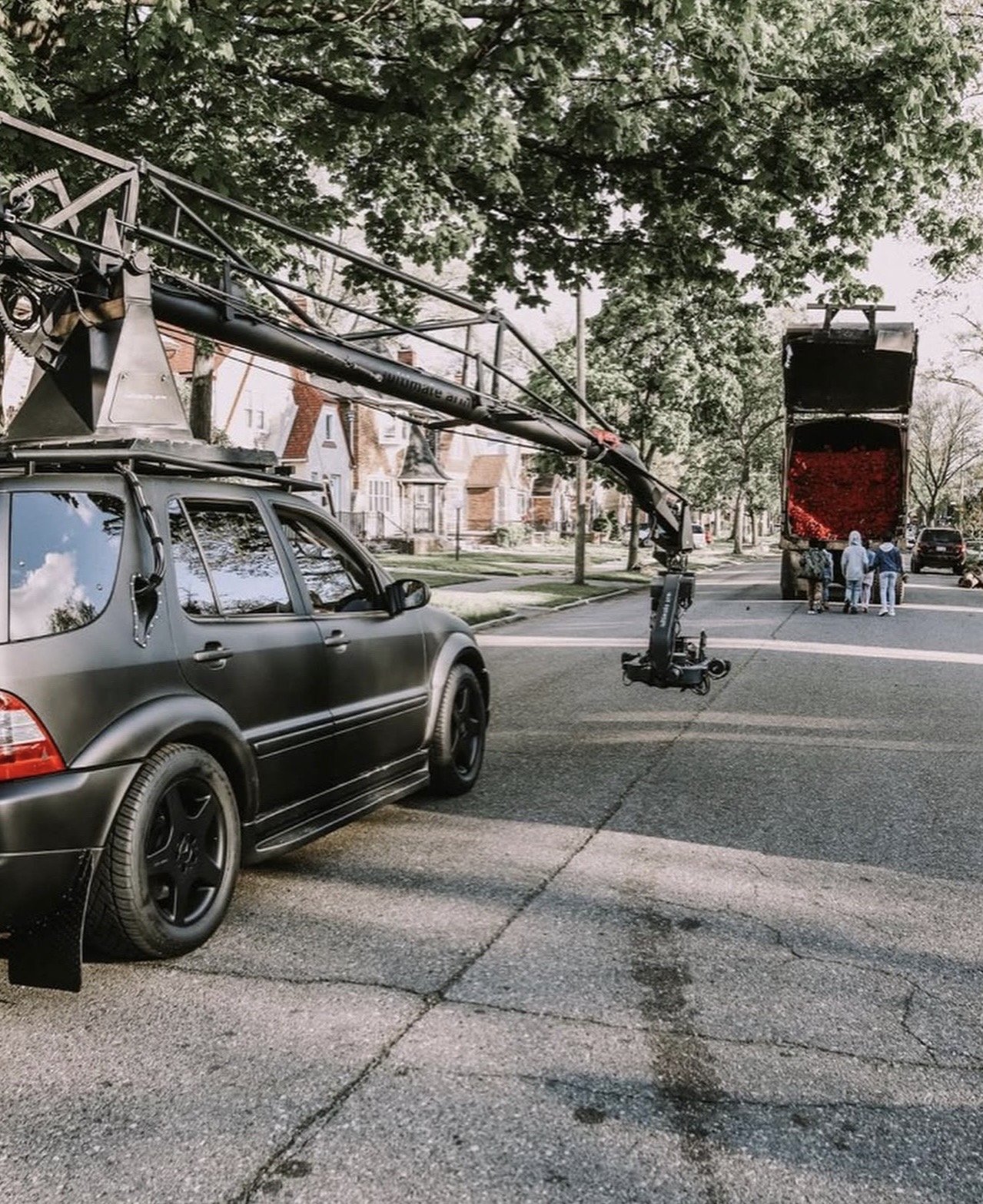
In the visuals for “Single Again,” there’s a scene that lives rent-free in my mind. A garbage truck drives through the neighborhood, but instead of trash, it’s overflowing with roses. As it moves, flowers spill into the street and children run behind it. A garbage truck is typically associated with what’s discarded— what a city throws away. But here, it carries beauty. In a place often reduced to headlines about struggle, this moment feels intentional. It reframes what we think we see. Instead of focusing on what Detroit has lost, the visual highlights what continues to bloom. Even the next generation is shown chasing it. Director Lawrence Lamont later shared that the roses are a metaphor of the team putting love in the city. That intention shifts the moment entirely. It isn’t just aesthetic— it’s deliberate. That’s storytelling.
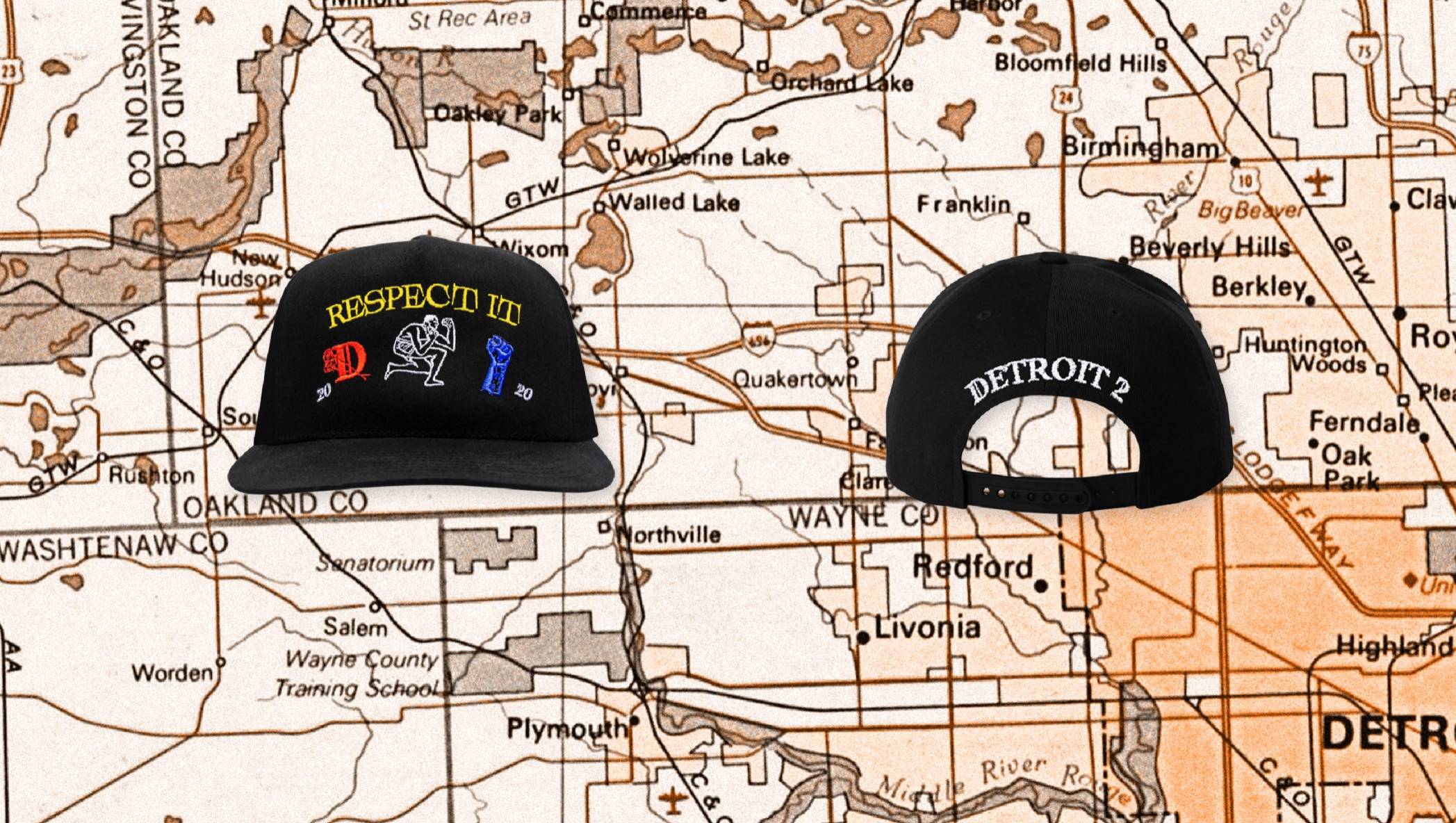
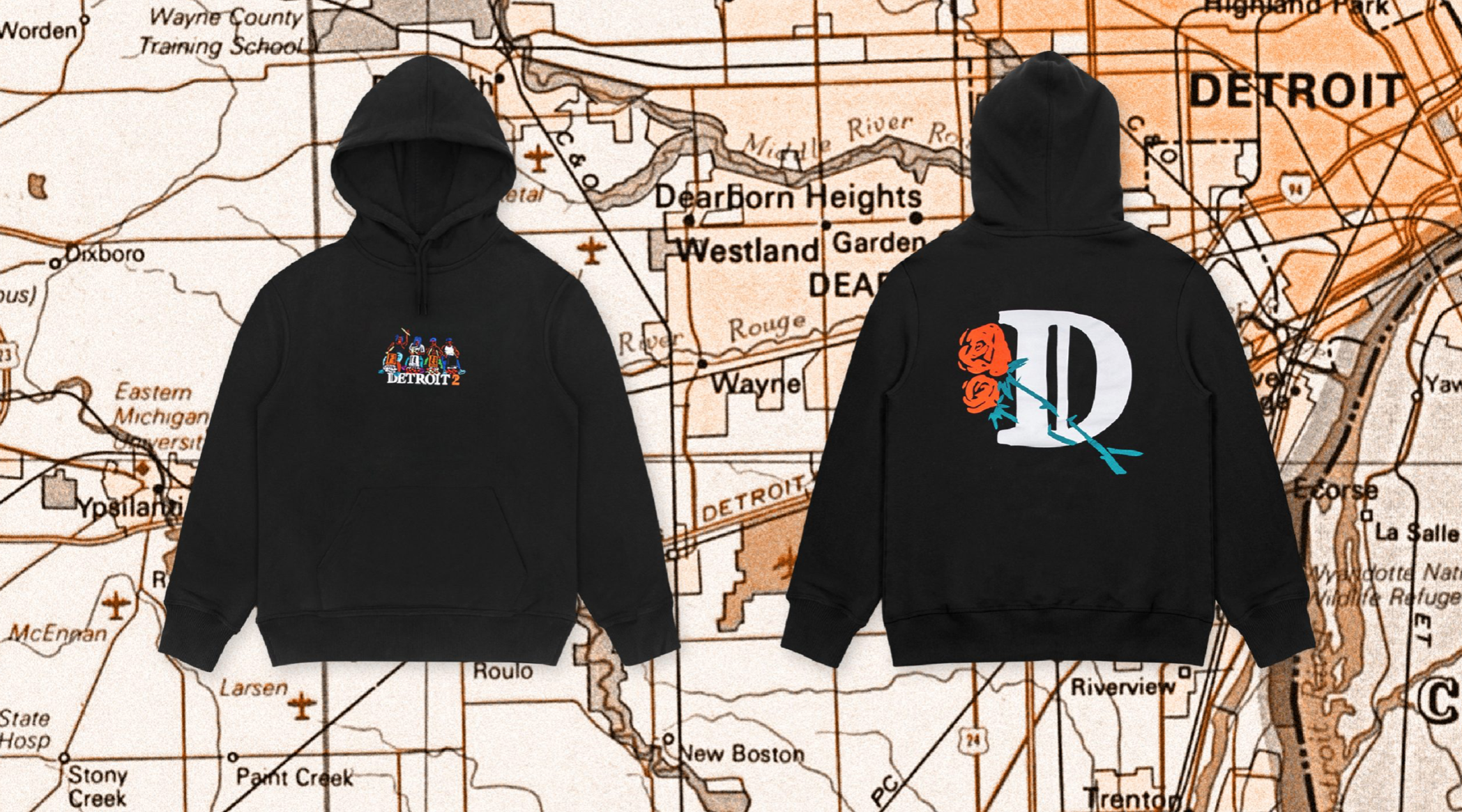
What makes this moment stronger is that it wasn’t confined to a single scene. This visual language carried beyond the screen and into everyday life. The merch didn’t just repeat a motif— it reinforced a message. Detroit wasn’t treated as a backdrop; it was at the center. From the map-inspired promotional imagery to the phrases and landmarks printed across the pieces, the city remained at the forefront. This was a creative team that understood cohesion— and how to build a world where home is always visible.
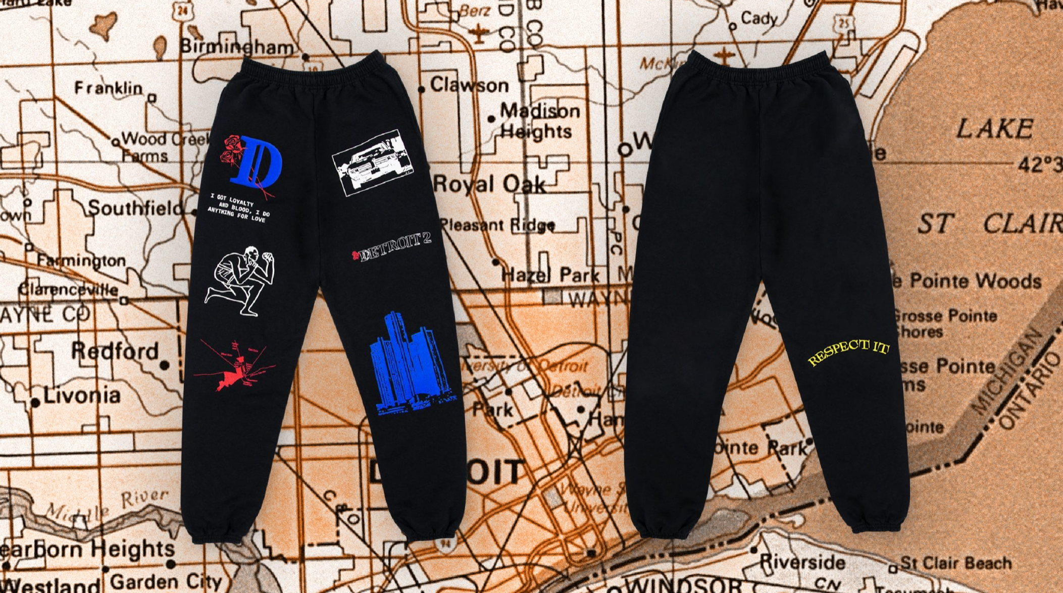
Rather than a focus on a past lover, this project reads as a love letter to home. Not all stories are soft. Some are resilient. Some are rooted in pride. Some are built with the intention of reframing how a place is seen. Across packaging, film, and fashion, Detroit was never an afterthought— it was the focus. That kind of cohesion doesn’t happen by accident. It happens when a creative team understands the responsibility and the privilege of telling a city’s story.
How do you view where you’re from? How can you show that through the work you produce? Maybe it starts with intention. Maybe it starts with observing details you once overlooked. However it begins, the stories we choose to tell about our cities matter. If this reflection stirred something in you, I’d love to hear what home looks like through your lens.